There's absolutely nothing like a good before-and-after, especially when I get to take part in the magic! So let's start with the "before" of the front room of the house:
before
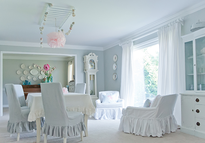
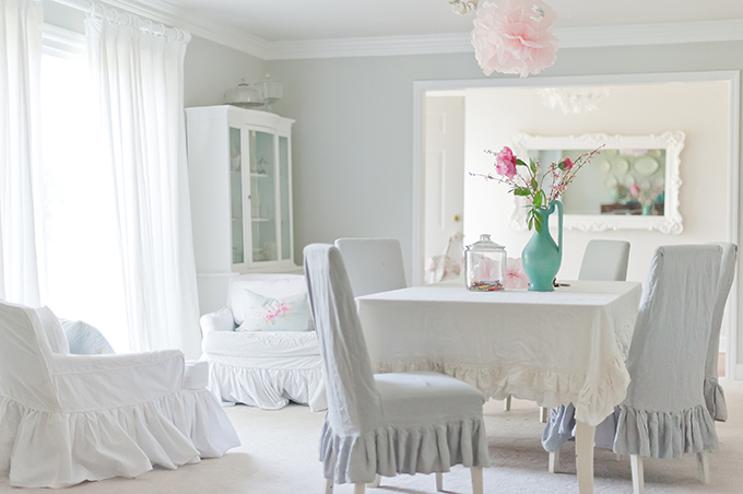
My client, Christiana, wanted a breezy space with only a whisper of color on the walls. I brought out lots of colors to show her, and she kept saying, "that's too much color!" We finally chose Benjamin Moore's Gray Owl for the walls and Chantilly Lace trim. Gray Owl, a light gray with the slightest blue undertone possible, is the perfect backdrop for all her white fabric and painted furniture.
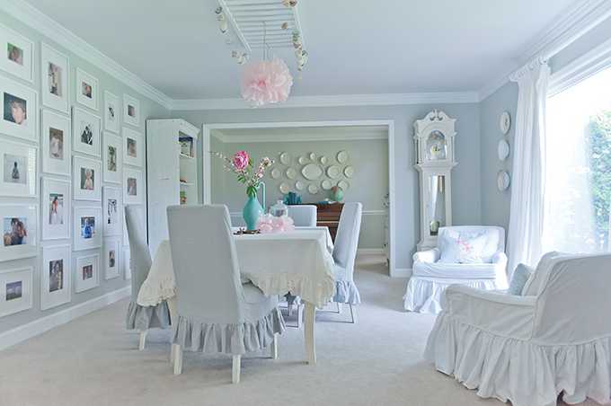
At my suggestion, she actually painted the 1980's glossy wood grandfather clock white. The piano you see is next on the list for a paint makeover! I have another client who no longer needed it, so I hooked them up and Christiana got to take this baby home for FREE.
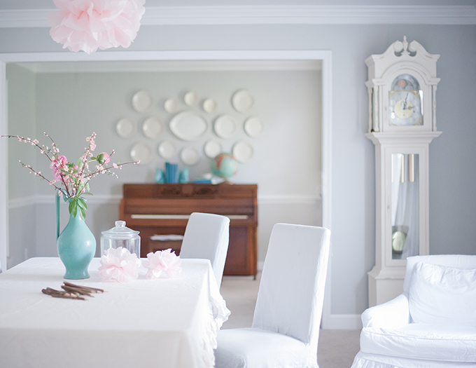
Maybe I can convince her to paint it turquoise!
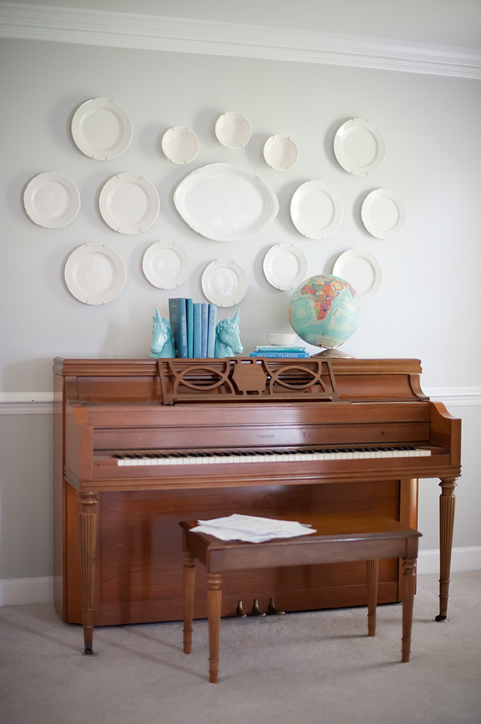
Again, the previous color palette was warm and fairly dark. It's difficult to imagine all the white furnishings in a space like this, isn't it?
before
This inexpensive IKEA light fixture makes a formal entry a bit more playful.
The dining room serves double-duty as a homework and craft space for her children. The lack of overhead lighting makes an opportunity for creativity - my client hung an old ladder from the ceiling and uses it to hang paper garlands, pom-poms, and other crafted lovelies.
This is a "before" shot from the opposite side of the room. The oak trim dictated warmer colors, not the cooler palette my client was hoping for.
before
The bright, white trim makes a huge difference in the space. The oak trim pulled your eye and chopped up the room. With white trim and light gray walls, the entire room looks larger, more open, and quite heavenly! Christiana made all of the beautiful slipcovers in this house. Her specialty is ruffled tablecloths, which you can find in her Etsy Shop, Ruffled Linens.
As we move into the family room, you can see how dark this space was previously. Although the paneling had already been painted, the brick wall dominates the space and the oak beams look dated.
before
To give my client a clean, fresh look in this living room, I chose Benjamin Moore's Classic Gray for the walls, Chantilly Lace for the trim, Kendall Charcoal for the beams, and Gray Owl for the ceiling. Of course she wanted a lighter, brighter room, but Christiana had no idea how much LARGER her room would appear with the new paint color scheme.
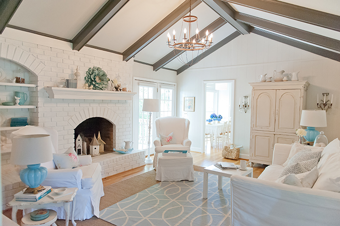
after
Christiana ordered a large jute rug from Pottery Barn, and then we layered it with a smaller, graphic blue-and-white flat weave rug I found on RugsUSA.
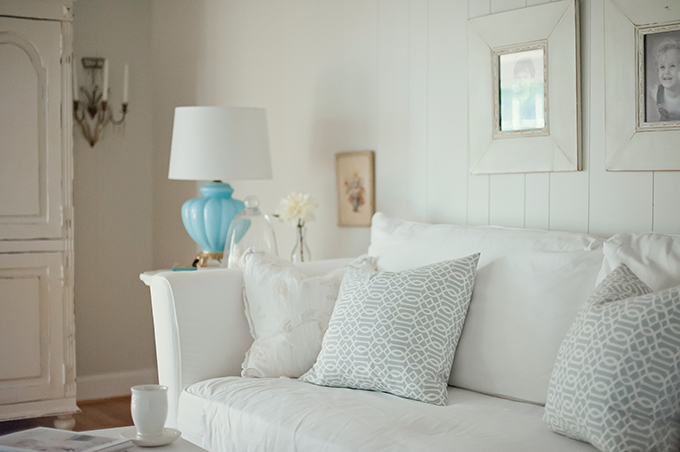
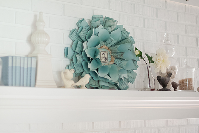
I found this crafted paper wreath at a local antique mall. That picture in the middle is of Napoleon!

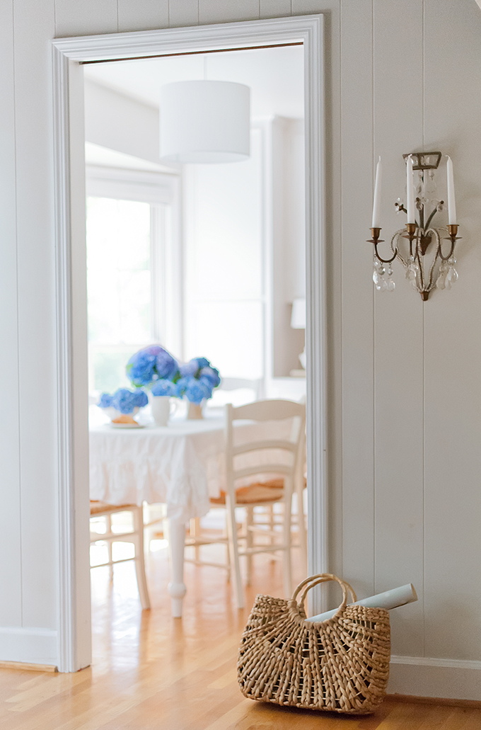
No major money was sunk into the breakfast room - a kitchen doesn't need to be fancy to be beautiful. Ikea lighting, white plates, and a white ruffled tablecloth that my client makes for her Ruffled Linens Etsy shop are all that's needed to put the focus on the outdoors beyond and the blue hydrangeas from her garden.
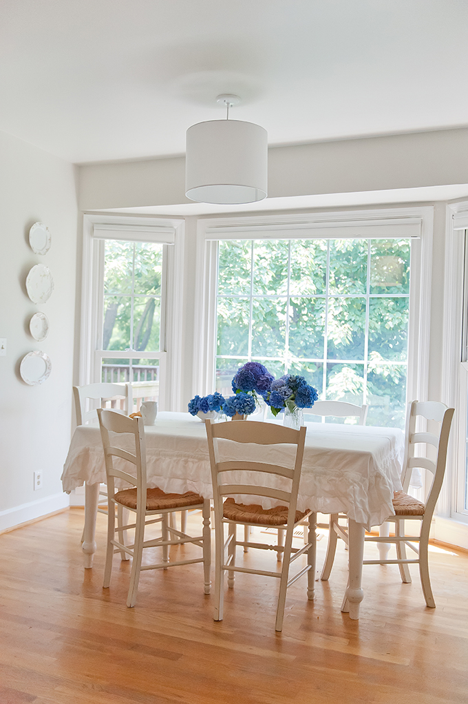
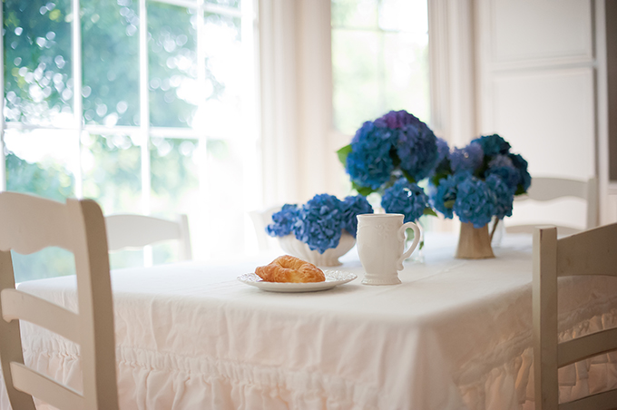
I hope you enjoyed the befores-and-afters of this Nashville home! Thank you to Erin for letting me share here again on her beautiful blog. If you want to learn more about transforming your home by choosing beautiful paint colors, mixing high and low decor, and arranging furniture and accessories, please come visit me at The Decorologist!